How to Make Your Packaging Stand Out on Shelf
When it comes to packaging, I'm a total pervert. When I go into a store I don't just pick something off the shelf and put it in my basket like a normal person - nope, nooo siiir.
I treat it like it's having a full medical inspection. I'll pick it up, rub it a little (any interesting texture on that cardboard? A spot of UV varnish perhaps?), give the blurb a read like it's the latest Sally Rooney, check underneath to see if there's anything fun on the bottom (bonus points for a jazzy barcode!), and heck maybe I'll even give it a quick sniff…like I said, total perv.
So like any good pervert, here are some field notes of my findings about what makes for successful packaging, jotted down in my notebook from the bush where I'm hiding with my binoculars.
1. First things first, know your brand
A clear understanding of why your brand exists is essential for an effective pack design. What is your brand about? How do you communicate your personality, mission and values? Take Oatly for example - their packaging features a crystal clear tone of voice that let's you the customer know exactly what they're about and lays the groundwork for a deeper connection with your target audience.
2. know your audience
When designing anything, the key is always to start with your audience. Knowing your customer's desires, needs, and pain points is crucial in order to be able to design strategically. Before designing your packaging it's essential to know what your audience are looking for and how your brand is meeting that want or need.
3. know who you’re up against
It goes without saying but having a solid grasp of your competitors is critical when launching a new brand or product. In order to persuade a customer to pick up your product in store (or click on your digital ad), you need to know what the current offering is and communicate how you are different and/or better. Having an understanding of the fixture that your product will be sitting in will allow you to work out how you can stand out from your competitors and shake things up!
4. avoid the urge to clutter
In the past we've found that brand founders are tempted to want to shout about all of the great things about their product on the front of pack. Listen, I get it! You've spent all this time developing this fantastic product and you want the world to know that it contains 8 different kinds of hard-to-source micro-herbs! To this my advice would be: do this at your peril! Your customer simply doesn't have the bandwidth to digest the eleven USPs you want to put on the front of pack.
5. make the most of the space
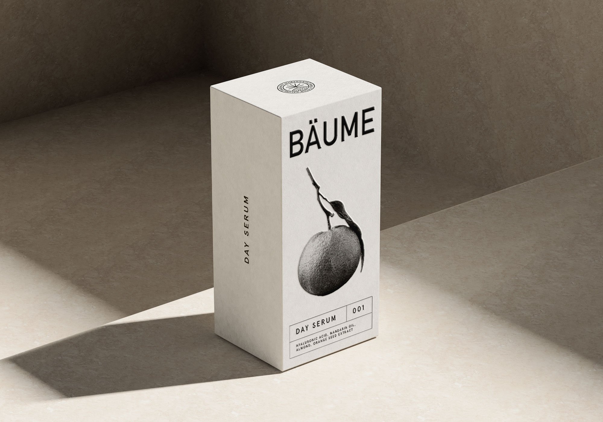
One of the biggest packaging mistakes we find is people neglecting the sides and back of the pack! The front of pack gets aaall the attention, and the sides and back are left to languish like sad wallflowers. I get the logic - your job is to get people to pick your product up over your competitors, right? But here's the thing - this might be the first interaction a potential customer has with your brand so why not make it count?! You've done the hard part and got them to pick up your product, so don’t waste a captive audience! Treat the whole pack like a canvas and use it fully to showcase who you are and why they will love you. It's prime brand real estate (and you can consider me packaging's answer to Selling Sunset's Krishell).
6. GO GREEN OR GO HOME
This isn't exactly a hot take, but sustainability needs to be a priority. Do your research on what packaging options are going to be the most environmentally friendly, look at whether there are ways your product could be refillable or reusable, scrutinise every piece of packaging your product includes and whether it's necessary / the most eco option available. Customers are (rightly) very savvy about over-packaging so strive to avoid it wherever possible.
7. If in doubt, test it out
If you're not sure about a particular piece of copy or messaging, or you're toying between a couple of image choices, gather a handful of trusted friends (ones whose opinion your value and trust) and see which they go for. At the risk of opening the floodgates to all their opinions, keep the questions specific and closed.
8. future proof
Whether or not you have plans to extend your range, it's worth thinking about how different variants would work. If you launch a new flavour or scent how would that look? How would the SKUs look together on the shelf - do they make sense as a range? Do they stand out on shelf? Consider the long-term vision in order to avoid additional design and print costs when you come to extend the range.
9. don’t neglect your secondary packaging
If you're a DTC brand or have an e-commerce shop, then remember that the unboxing experience is just as important as the product packaging itself. With the rise of e-commerce, customers are more and more accustomed to receiving beautifully packaged products, so if you want to make a lasting first impression, invest in the unboxing touchpoint as something that can really spark joy.


