Welcome to Packaging’s Chaos Era
Olive oil in a can? Tampons in an ice cream carton? Suncream in a whipped cream bottle?
If you've come across any of these packaging designs in the wild, you might have done a bit of a double take.
What all these product have in common is that they are trailblazing a new trend of choosing unexpected packaging formats, generally ones that are more typically associated with a different category. It's something I've noticed happening more in recent months, but hadn't seen it articulated until I stumbled upon this tweet that referred to the rise of “Chaos Packaging”.
I love that name. Because milk in a pouch does feel a bit chaotic 😂. BUT there's solid strategy behind this design trend, and if you're a founder launching a brand I would encourage you to explore it when it comes to selecting your packaging format.
You can watch me give an overview of this latest trend here.
Let's explore why chaos packaging is so powerful and how you can leverage it to stand out.
HERE'S WHY YOU SHOULD EMBRACE CHAOS PACKAGING:
👉 disrupts the shelf
Breaking with convention with a visually distinctive format, you can't help but stand out on shelf. If you're in a saturated market (and let's be honest, who isn't these days?), having a scroll-stropping format is a relatively easy way to get people noticing your product and encourage them to take a closer look. Blending in just isn't going to cut it these days.
👉 Creates a memorable look
Being ‘that coffee in a tube’ or ‘that milk in a pouch’ brand will stick in people's head much more than an equivalent brand in a regular format. It means your actual design and copywriting don't have to do all of the heavy lifting when it comes to standing out. In a sea of glass tampons in boxes, I would definitely be intrigued to pick up the one in an ice-cream tub (listen, I might not actually end up BUYing it, I am alas, somewhat older than their target demo, but it's interesting none-the-less 😂).
👉 Innovation shows you care
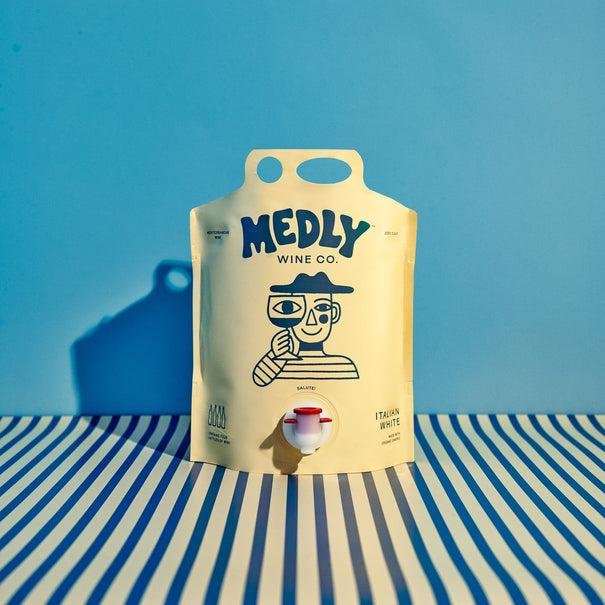
Having an unconventional packaging format shows that your product has been carefully considered. Sure, you could have created something that was like all the other products out there, but you wanted to innovate and launch something superior. It reveals a lot about who you are as a company, one that is committed to questioning the status quo and delivering a better experience for the end user. Medly's wine isn't just in a pouch for no reason - by moving away from the traditional glass bottle, they are providing something that is more environmentally friendly (lighter to transport) and more convenient for the consumer (wine stays fresher for longer).
👉 Aligns you with a neighbouring category
By utilising a packaging format typically associated with a different product, it gives you an aesthetic link to that other category. For example, this drink is packaged in what most people would consider a hand-soap pump, which, coupled with the minimal label design, associates them more with premium skincare brands than other drinks brands. By borrowing these design cues, you're reinforcing to your audience that this product is meant for them.
👉 Has instant social media appeal
Visually striking packaging will boost a product's social shareability. By placing a familiar product in an unfamiliar packaging format, you make people do the digital equivalent of a double-take, i.e. stop scrolling. This coffee in a tube is exactly the kind of ‘conversation-starter’ that goes viral on social media and puts your brand on the map.
👉 Easy on the purse-strings
By utilising existing packaging formats from other categories, you don't need to get an expensive, bespoke packaging solution. All of the examples I shared in the Insta overview are all common formats in different categories. It's a cost-effective way to get you seen.
👉 Capitalises on your size
It's much harder for a huge multi-national corporation to test a new packaging format. It would simply involve too much upheaval. Being nimble is the secret weapon of a start-up - you can be try things out on a small scale in a way that larger companies can't.
Why I love this trend is that 'Chaos packaging' teaches us the power of looking beyond our direct competitors for inspiration and to stop and question whether there's a better format, whether for convenience, style, sustainability or usability.
So get out there and get chaotic 🤠


