Brief
Develop a warm, credible brand identity and packaging design for a premium supplement brand that supports and reassures mothers-to-be. The look and feel should balance clinical trust with emotional care, nurturing confidence at every stage.
Client
CareNatal CareNatal is a supplements start-up based in the U.S., dedicated to providing high quality, doctor-developed products to support women on their fertility and pregnancy journeys.
Services


The situation
What challenge was our client facing?
Our client was launching a premium supplement brand for mothers-to-be and needed a visual identity that could strike the right balance between clinical credibility and emotional care. They wanted to move away from the cold, medical feel often associated with supplements and instead create a brand that felt nurturing, trustworthy, and beautifully designed, one that would reassure expectant mothers and reflect the quality of the product inside.


The Task
What outcome were they hoping to achieve?
They were aiming to build a brand that mothers-to-be could genuinely connect with, something that felt both trustworthy and comforting. The goal was to position the supplements as the go-to choice in a crowded market, with a brand identity and packaging design that reflected quality, care, and credibility. Ultimately, they wanted their audience to feel seen, supported, and confident in choosing their products during such a significant life stage.
The action
What steps did you take to help them get there?
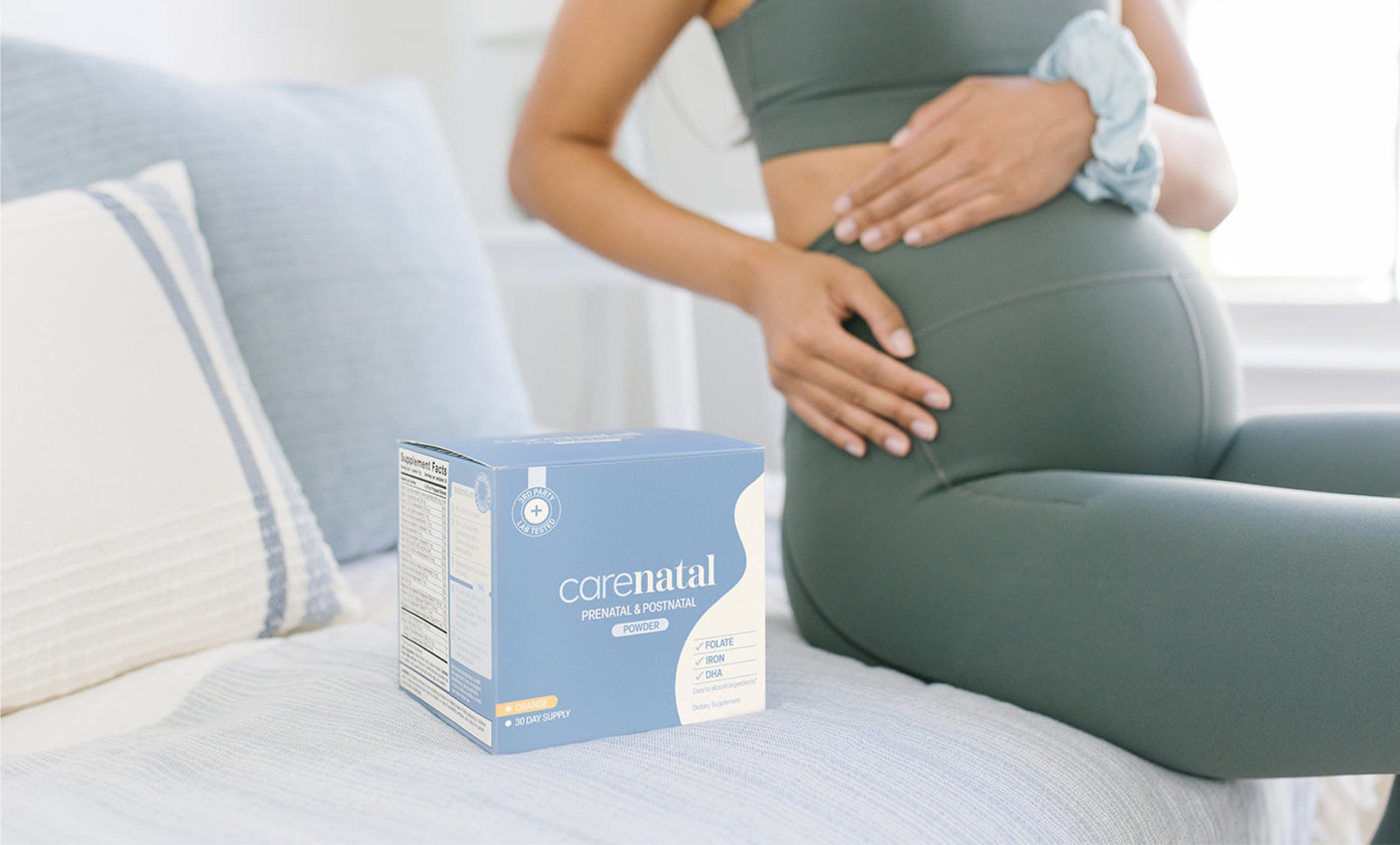
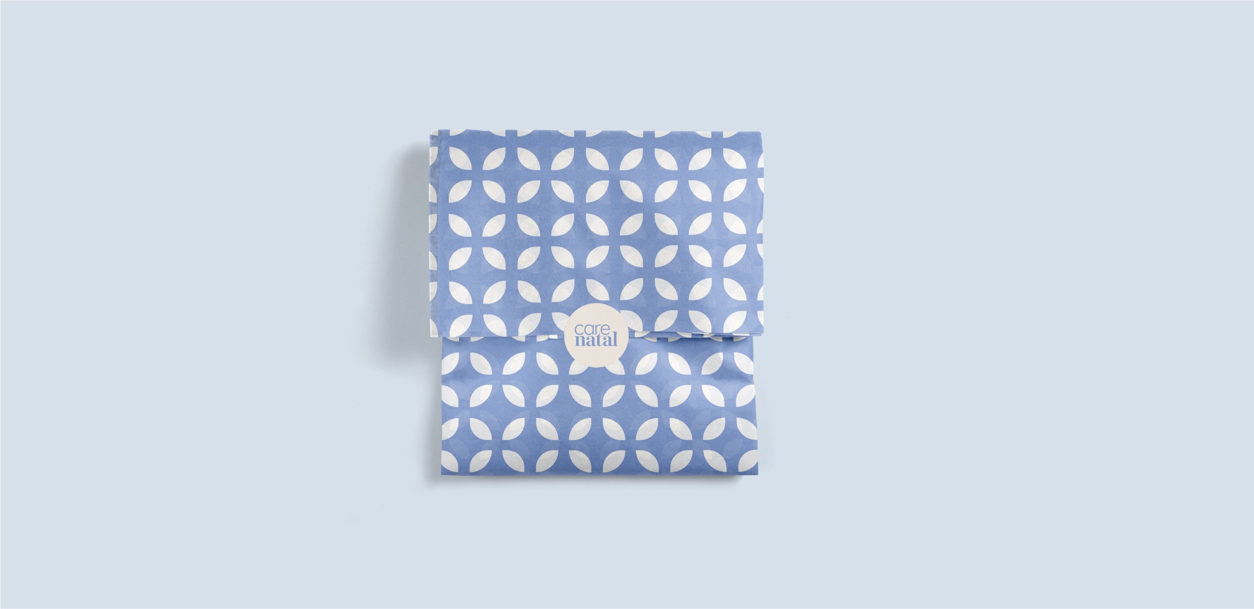
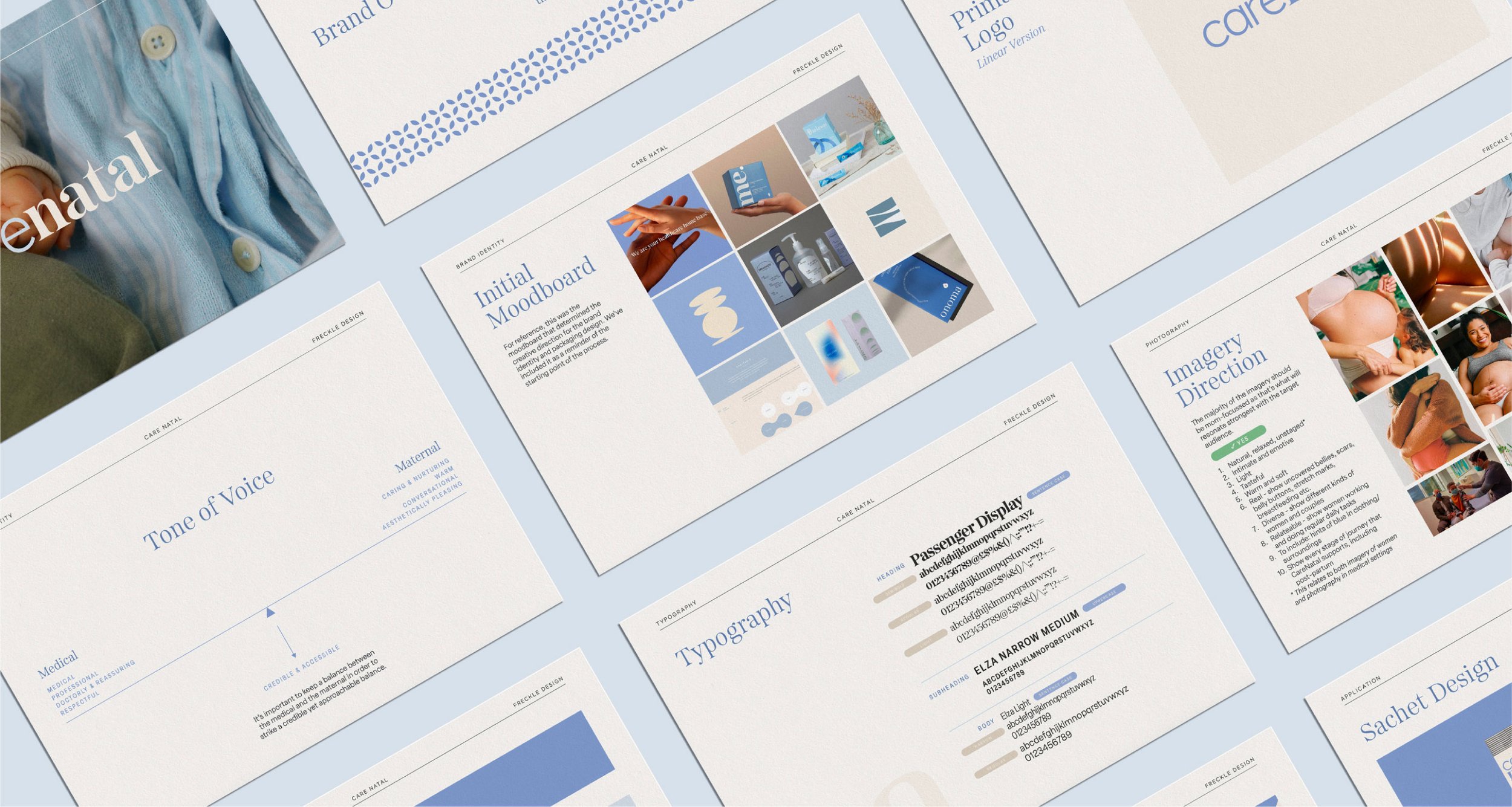
We crafted a brand identity that balanced softness and strength, using a calming colour palette and curved graphics alongside more clean and clinical graphics.
To ensure consistency across touchpoints, we developed brand guidelines to support future product launches and marketing needs as the business grows.

The Result
What was the final result?
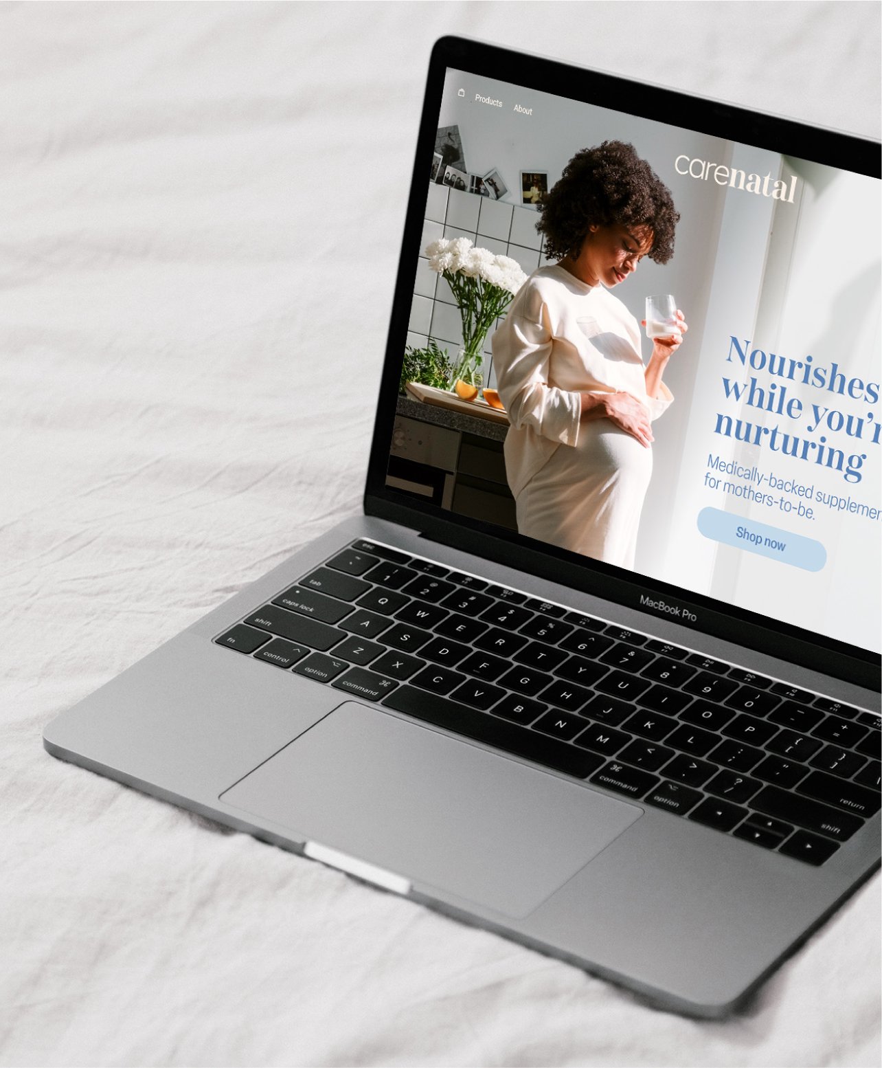
The final result is a brand that feels both nurturing, trustworthy and visually appealing for mothers-to-be. With a calming, contemporary identity and beautifully refined packaging, the brand now stands out on shelves and connects emotionally with its audience.
It communicates care, quality, and confidence at every touchpoint, setting the foundation for a strong and scalable presence in the wellness space.


What our
client said
“The final product would have never been as great as it was if it wasn’t for Freckle’s due diligence, hard work, and commitment to always go above and beyond.”
“Freckle went above and beyond on our brand identity project. She dove deep on research and was not afraid to speak up when she felt like the project was heading down an ill-advised direction.
I selected Freckle due to their expertise and keen eye for design, so I was so glad to see that they stepped up into that role of a “design partner” instead of just being a “graphic designer”. They truly took the time to understand our brand strategy and aligned all of their work to our goals and visions.
The reaction to the branding has been phenomenal and I am already looking for any excuse I can to commission them for another project!
If you are someone considering Freckle, I would tell you not to waiver and book them asap. I saw during the course of my project just how far out they were getting booked and considered myself lucky to have gotten on their calendar on an spot right after the holidays!”
zawwar, founder
