Brief
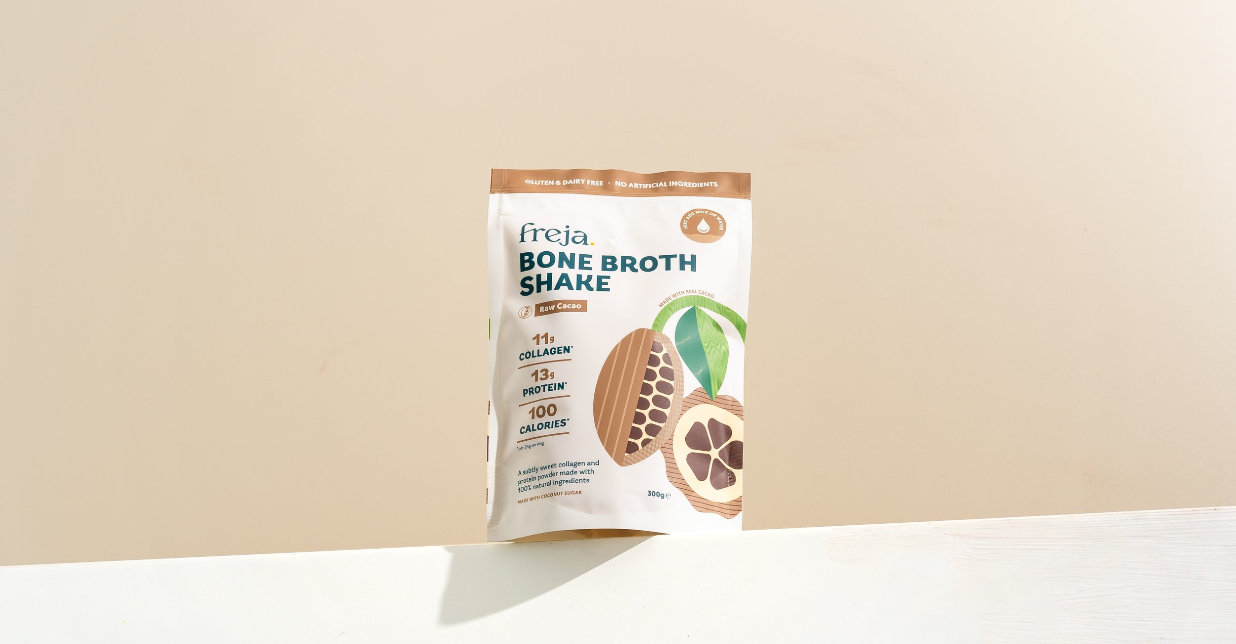
Create eye-catching packaging designs with bespoke illustrations for a delicious range of sweet collagen shakes and savoury protein powders.
Evolve the brand identity, refining the existing elements and creating additional assets to expand the off-pack world.
Client
Freja is dedicated to bringing the ancient benefits of bone broth into modern, everyday wellness routines with the highest quality ingredients and super convenient formats for health-focused, busy consumers.


The situation
What challenge was our client facing?
Freja approached us in need of updated packaging for their collagen shakes and protein powders. While they had an existing brand identity and packaging system in place, it no longer fully aligned with their evolving brand strategy. They were looking to refine their visual identity - bringing greater clarity, cohesion, and sophistication to their packaging to better reflect the brand’s updated positioning and resonate more deeply with their audience.

The Task
What outcome were they hoping to achieve?
Visually, they wanted to shift away from the cool, minimalist Scandinavian aesthetic that defined their early look, toward something warmer, more inviting, and emotionally resonant. As their business was growing rapidly, they also needed a more flexible design system - something that could scale with them and empower their team to quickly create marketing assets in-house without compromising brand consistency.
The action
What steps did you take to help them get there?
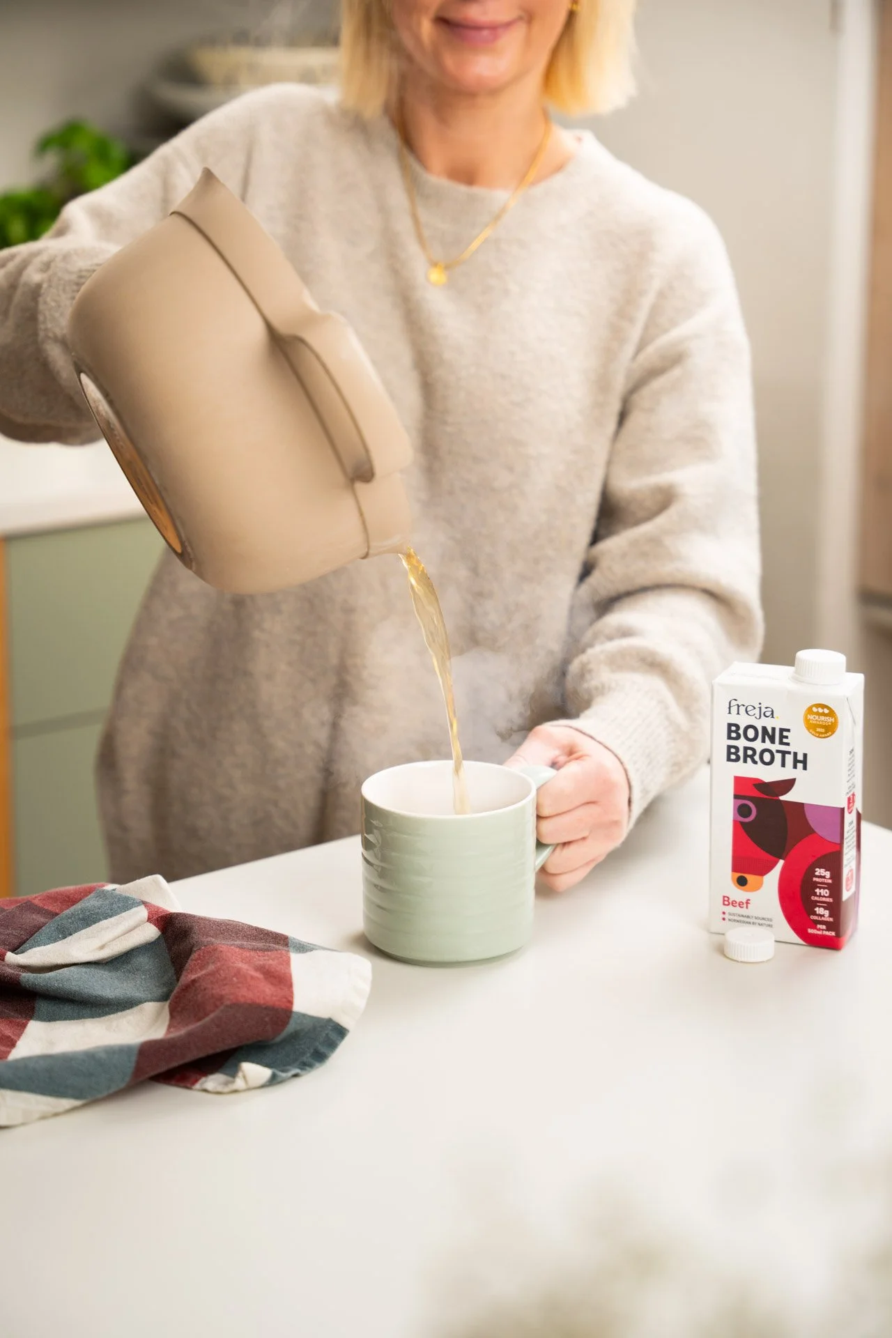
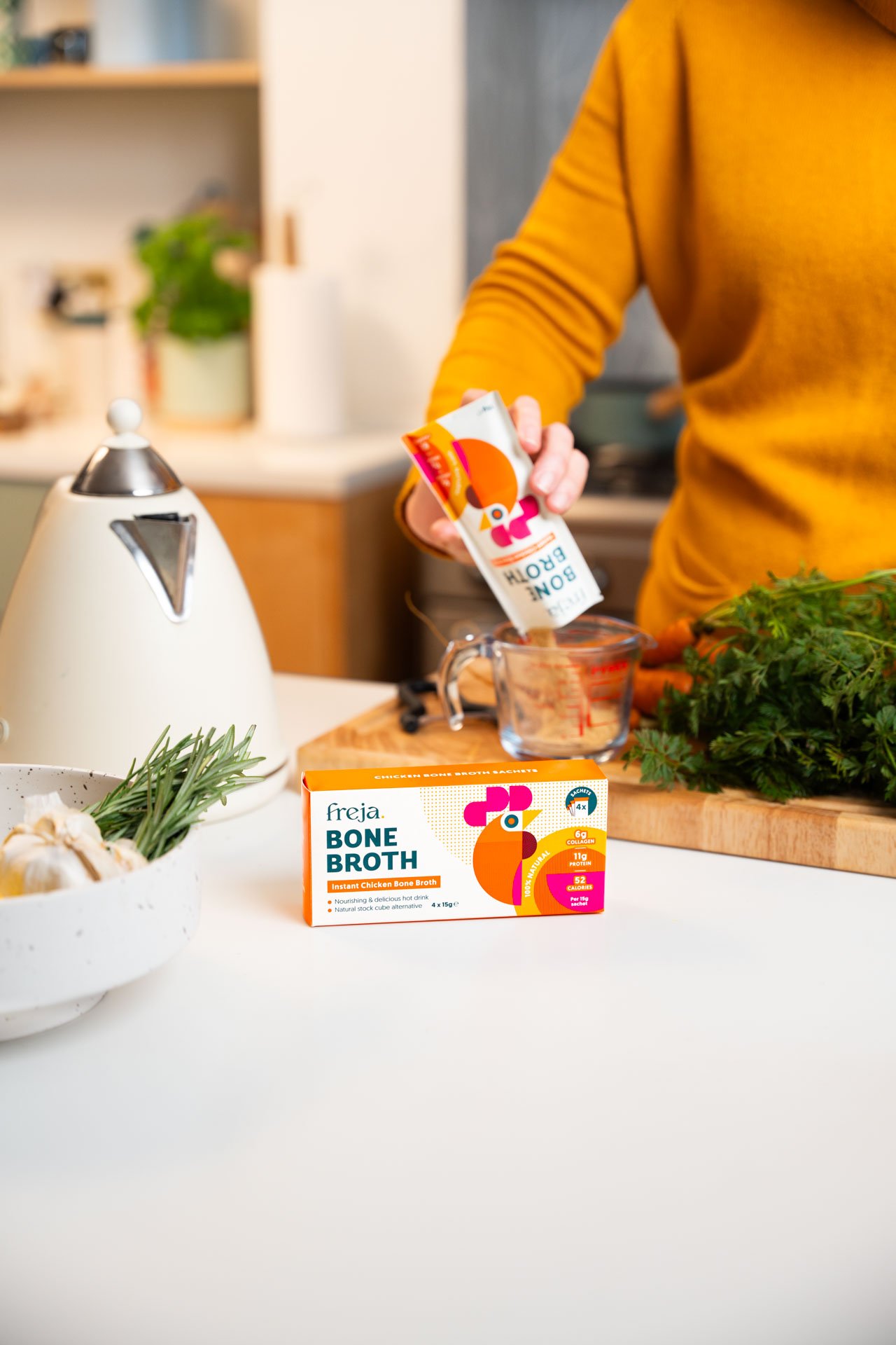
To help Freja achieve a more inviting and human brand presence, we reworked their colour palette, replacing cool, clinical tones with warmer shades. We introduced a soft serif typeface into their font suite to balance the clean lines of their existing identity and bring in a sense of warmth and character. Alongside this, we created a library of custom patterns and icons for use across digital and print touchpoints, redefined their brand guidelines for internal consistency, and developed a refreshed creative direction for their photography.


The Result
What was the final result?
Freja now has a cohesive brand identity that truly reflects their updated strategy - warm, welcoming, and built to scale. We equipped their team with an extensive, easy-to-use asset library, all neatly documented in a new set of brand guidelines. With a refreshed creative direction for photography, a full suite of packaging designs, presentation templates, and a line of branded merchandise, Freja’s internal team is empowered to create consistent, on-brand content as the business continues to grow.


What our client said
“Working with Freckle has been an absolute game-changer for our brand. Since working with them we have secured listings in Ocado, Tesco and Holland and Barrett.”
“Over the past six months, they have transformed our brand identity, creating fresh packaging designs and refining our visual identity to reflect our updated brand strategy. The designs have received fantastic feedback, have amazing stand-out on shelf and really resonate with our customers.
We initially engaged them for a one-off piece of work but have continued to work with them across multiple projects, from top level creative direction and photography to day-to-day design projects.
Their attention to detail and real understanding of our brand identity have helped refine and elevate our overall presence in the market. Claudia brought creativity, strategy, and a collaborative spirit to every step of the process. We couldn't be happier with the results and highly recommend them to any brand looking to stand out.”
JESS, co-founder


